Pythonでグラフまとめ(指数関数、シグモイド関数、対数関数)
2022/3/24 2022/4/15
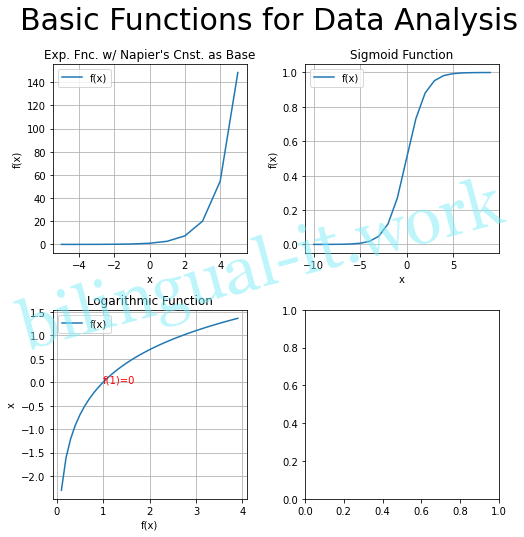
先日指数関数、シグモイド関数、対数関数の描画方法をまとめましたが、今回は同じグラフですが、1つのFigureの中に3つのAxesを並べてみたいと思います。
コード
コードはこちらです。
import matplotlib.pyplot as plt
import numpy as np
import math

fig = plt.figure(figsize=(8, 8))
ax1 = fig.add_subplot(2, 2, 1)
ax2 = fig.add_subplot(2, 2, 2)
ax3 = fig.add_subplot(2, 2, 3)
ax4 = fig.add_subplot(2, 2, 4)

# Exponential Function
x1 = np.arange(-5, 6, 1)
y1 = float(math.e) ** x1

ax1.plot(x1, y1, label="f(x)")
ax1.set_title("Exp. Fnc. w/ Napier's Cnst. as Base")
ax1.set_xlabel("x")
ax1.set_ylabel("f(x)")
ax1.legend()
ax1.grid()

# Sigmoid Function
x2 = np.arange(-10, 10, 1)
e2 = math.e
y2 = 1 / (1 + e2 ** (-x2) )

ax2.plot(x2, y2, label="f(x)")
ax2.set_title("Sigmoid Function")
ax2.set_xlabel("x")
ax2.set_ylabel("f(x)")
ax2.legend()
ax2.grid()

# Logarithmic Function
x3 = np.arange(0.1, 4, 0.1)
y3 = np.log(x3)

ax3.plot(x3, y3, label="f(x)")
ax3.set_title("Logarithmic Function")
ax3.set_xlabel("f(x)")
ax3.set_ylabel("x")
ax3.text(1, 0, "f(1)=0", size=10, color="red")
ax3.legend()
ax3.grid()

# Wrap-up
plt.subplots_adjust(wspace=0.3, hspace=0.3)
fig.suptitle("Basic Functions for Data Analysis", size=30)
plt.show
実行結果
Jupyter Notebookで描画してます。

- めっさん
当サイトの管理人。ニューヨークの大学を飛び級で卒業。その後日系企業でグローバル案件に携わる。大小様々な企業を転々としながら、マレーシアやアメリカへの赴任経験を持つ。バイリンガルITエンジニアとしていかに楽に稼ぐか日々考えている。年齢は秘密だけど定年も間近かな。
- 私が管理職になりたくない理由 2026/7/14
- SIEMへのログ取り込みにはパースサーバが必要 2026/7/7
- FortiSwitch PoEの注意点(PoEポートの数) 2026/6/30
- バイリンガルITエンジニアとしてアピールする方法 2026/6/23
- AIの誤使用はやめていただきたい 2026/6/16